
Overview
Overview
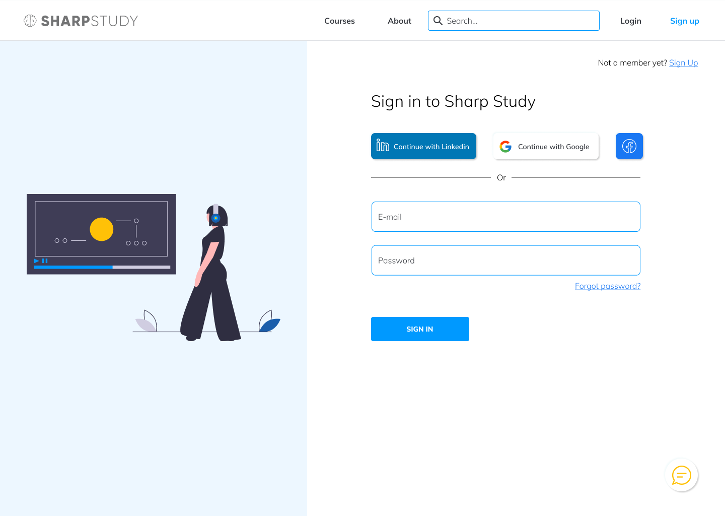
Super Translations is a website for a translation company. Its purpose is to help people get their documents translated into whichever languages they need.
As the UI designer, my job was to create a style for the brand and to ensure that the website not only looks good, but fulfills the client's business goals. The client was rather disappointed in the previous design, which was why I was hired to change the aesthetics and functionality.
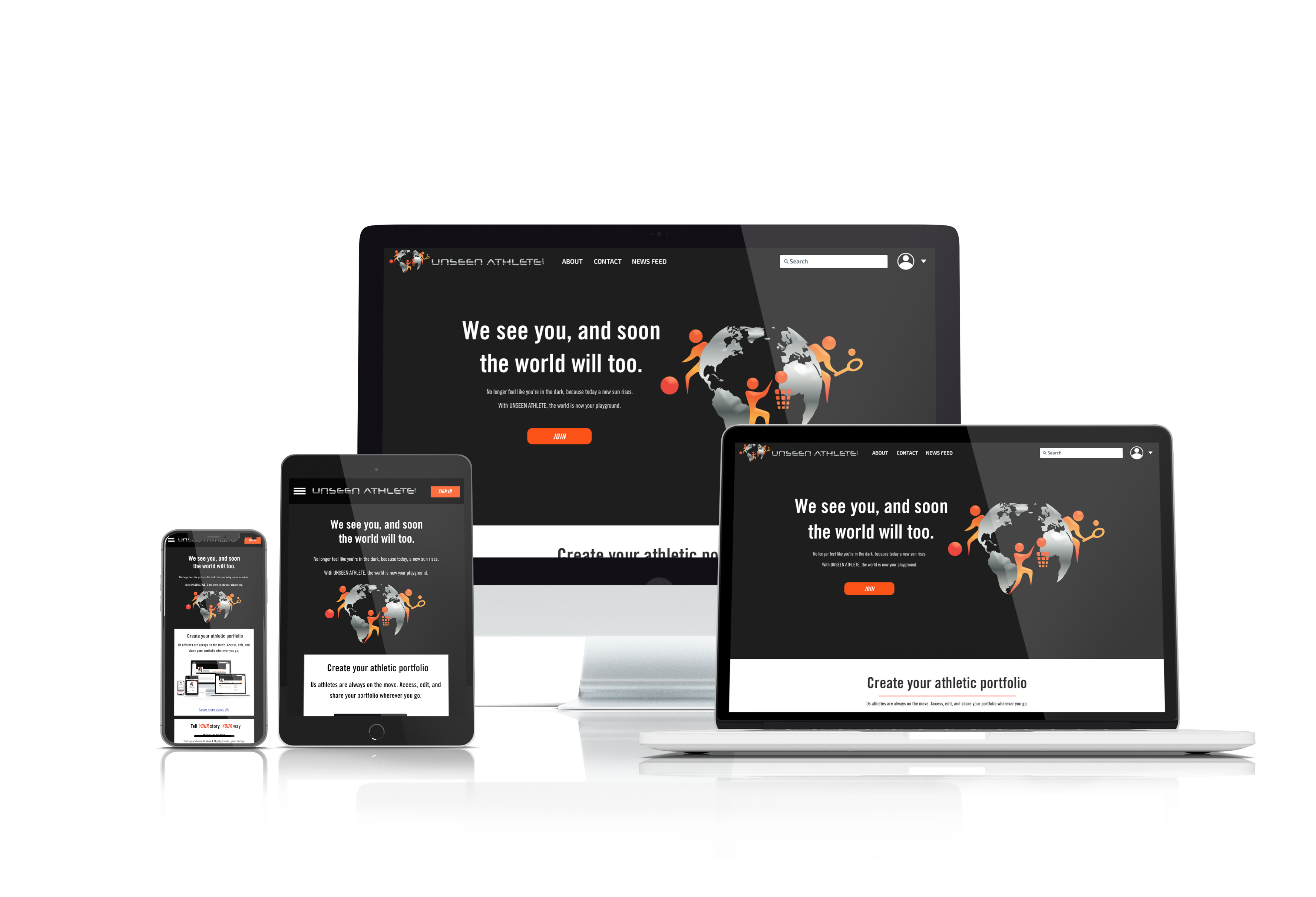
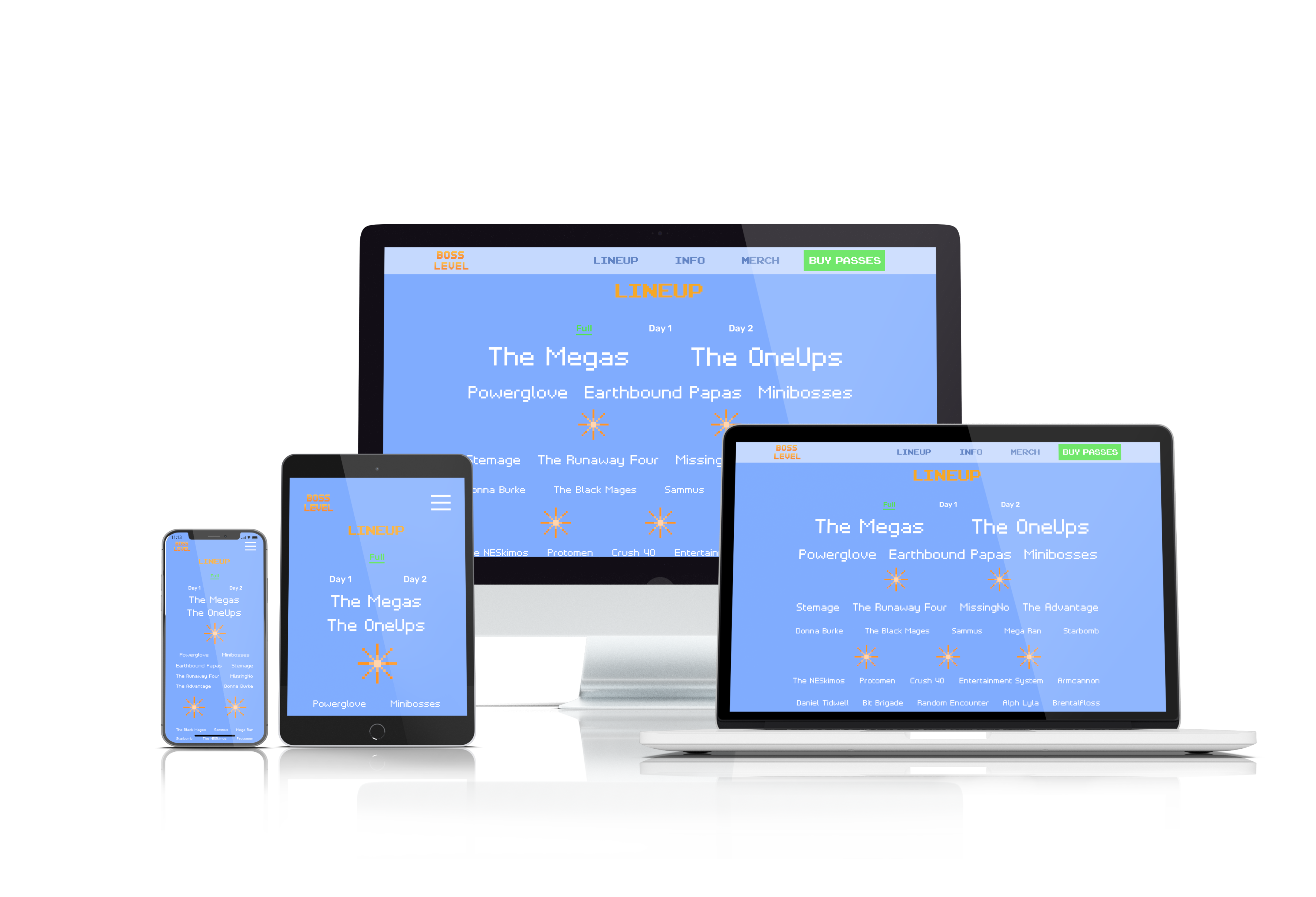
Unseen Athlete is a website that is meant to help athletes gain recognition. It is both a social media platform and a news website. Our UX and UI team worked with Unseen Athlete to deliver a modern responsive website that allows athletes to connect with coaches, talent scouts, as well as each other, while also providing news about the athletes featured on the website.
Research
Research
Gut Test
Gut Test
I conducted a gut test with the client to find out what they like and dislike in apps. We had approximately 20 different designs in total, and the client had up to 20 seconds to decide whether they liked each one.
We conducted a gut test with our clients to find out what they like and dislike in apps. We had approximately 20 different designs in total, and the clients had up to 20 seconds to decide whether they liked each one.


The client liked these designs the best. They liked clean designs with gradients. There was also a particular fondness for purple, violet, and similar colours. These factors were taken into consideration for the Super Translations website.
Our clients liked these designs the best. All of these had relatively dark backgrounds with colours that stood out. This meant that for our own designs, we should also have dark backgrounds with contrasting colours.
The Design Process
The Design Process
The Why—Design Inception
The Why—Design Inception
The central purpose of the website was predetermined: to create a website for translation clients to connect with translators.
With the Why figured out, I was able to move on to the mood, space, colour, shape, and movement.
We settled on a central reason for the project, i.e. the Why. It was to give all athletes the same opportunity to showcase their skills within their sport.
With the Why figured out, we were able to move on to the mood, space, colour, shape, and movement.

Style Tile & Brand Guideline
Style Tile & Brand Guideline
The ensuing mood board led to a style tile:
We split off into three different directions so that the clients can be given a choice. We wanted to find out if the clients really would prefer a dark theme with a significant amount of orange. We also wanted the clients to have a choice between orange and primary green, which is an especially vibrant colour that would definitely stand out on a black(ish) background).


I picked Open Sans and Source Sans Pro as they're clean, versatile, professional, yet not overly rigid. This ties in with how interpreters and translators are supposed to be. These two typefaces also pair well together.
In the end, the clients picked out elements from all three mood boards. They preferred the reddish orange from the white/orange mood board and they also really liked dark backgrounds. While the green did indeed look enticing, orange won out in the end. However, they did choose to go with Trade Gothic, which is as typeface associated with athletics (seen on the Nike website) and featured on the green style tile.
User Testing
User Testing
Wireframes
Wireframes
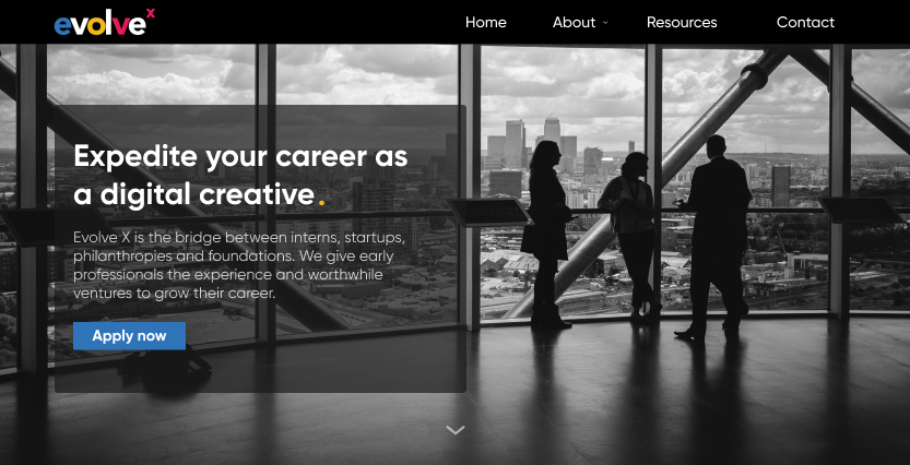
Prior to the redesign, the home page looked like this:
We added colours and graphics to the mid-fi prototypes to create hi-fi prototypes. We did run into a few hurdles along the way -- the biggest one was that the mid-fi screens were late, so we had less time to do the hi-fi screens. Thankfully we were all quite efficient at choosing colours, drawing up icons, etc. and we were able to finish the project on time.

The client found the colour scheme to be rather jarring, so she wanted something different. So I started by changing the aesthetics to match what we have in the style tile.

Notably, the logo had to be changed. This went through a number of iterations:


Usability Testing
Usability Testing
Testing showed that the top nav bar looked a little too busy. There was also no reason to have a contact form on 2 separate pages. So the contact form was removed from the home page.
We conducted a series of tests for various pages and made changes accordingly.

I used A/B testing where necessary, and incorporated the more popular version in the final prototypes. Of particular note are the header (top nav) and footer. These went through a number of iterations before being finalized. The final version had the social media links in the footer, with a phone number but no physical address.
Of particular note is the profile page. It was due to testing results that the tabs (experience, statistics, and media) were ordered that way.
Conclusion
Conclusion
The goal of the project was to redesign a website for translation clients to connect with translators. To this end, I updated the existing website according to the client's needs, wishes, and preferences. The highlight of the project for me was finding a colour scheme that the client liked, and which suited the website's purposes.
The app was well-received by the client, who proceeded to replace the dummy text. Actual users now use it to connect with translators.
The highlight of this project for me was crunch time towards the end. While our clients were always friendly and easy to talk to and the presentation went off without a hitch, it was on the day before the presentation that the team's UI designers came together and hammered out all the details in the hi-fi prototypes with incredible efficiency. While it certainly wasn't an easy experience, we discovered that we work in similar styles and that we could get quite a lot of work done fairly quickly as a team.
The app was well-received by the client, so with any luck, it will translate into satisfied users who actually use it to connect with talent scouts, coaches, and each other to advance their careers.
For future projects, I would like to create more interesting graphics with bold colours, and perhaps with a true dark theme rather than what amounts to a dark-coloured frame.
Further Info
Further Info
Prototype

Website
Other Works


Copyright 2021 Luke Yin. All rights reserved.