
About This Project
Halo: The Master Chief Collection is a collection of first-person shooters set in the Halo universe, of which most are focused on the titular Master Chief's story. In collaboration with Anthony Truong, I replicated and redesigned the menu system.
My Roles and Responsibilities
My task was to redesign the Halo MCC menu system, recreating the existing experience or making changes where it makes sense to do so. Since the menus are the same across different games in the collection, I focused on Halo 2: Anniversary, which is a remastered version of Halo 2 that was released with the Master Chief Collection.
Length of the Project
Each part of the project took about 3 weeks to complete, on and off, for a total of approximately 5 months.
Challenges
- To figure out the player journey as the game progresses
- To create paper prototypes and see if the flow can be improved in any way
- To create mid-fi prototypes with an improved player experience
- To create hi-fi prototypes with a similar art style as the original, with improvements where necessary
- To design the UI in a way that ensures colour blind players can also enjoy the game
Work Process
For this project, I did the following:
- Player Journey
- Paper Prototype
- Flow Chart
- Mid-Fi Wireframes
- Usability Tests
- UI Moodboard
- UI Style Guide
- UI Mockups
- Accessibility Compliance
Player Journey
I started by going through the existing Halo MCC game and figuring out the player journey for Halo 2: Anniversary.

Paper Prototype & Flow Chart
I made paper prototypes based on the existing game.

Based on the paper prototypes, I made a flow chart:

Wireframe & Iterations
I made mid-fi wireframes based on screenshots of the existing game.


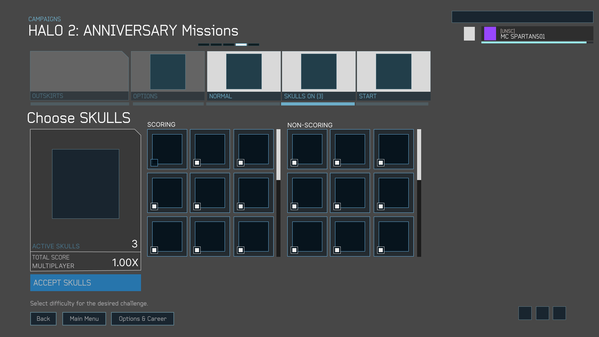
For the Choose Skulls screen, testing revealed that the Accept Skulls button was somewhat difficult to find, especially since previous screens had similar buttons in a different location. So I moved it to a more prominent location, in line with previous screens, and made it bigger.

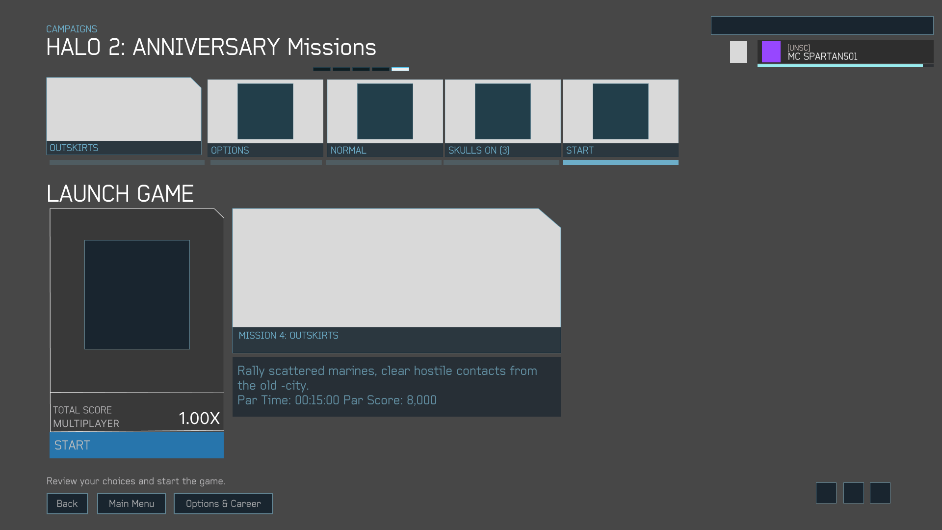
Through testing, I found that it would be better to make sure that other screens also follow this format, with a prominent button that leads to the next screen:

Here's the interactive prototype:
UI Styleguide & Mockups
I created a style guide based on the original styles. I decided to use Baksheesh as my main font for text. This is a font that closely resembles the one that's currently used in the game. It gives a somewhat futuristic and unusual feel, which complements the sense of wonder that comes from exploring ancient Forerunner ruins.

From there, I created hi-fi mockups:


Testing revealed that some text (i.e. 15/15 completed) would be hard to read if the player has certain types of colour blindness:


To solve this problem, I changed the grey part to white, which would provide enough contrast with the background:

By changing the text to white, there is now enough contrast for all types of colour blindness:


Here's the interactive prototype:
Outcomes
- Figured out the player's journey for the game menu
- Created paper prototypes to replicate the flow
- Created mid-fi prototypes based on the flow chart, and changed button positions according to test results
- Created hi-fi prototypes with the same art style as the original, with screens based on the mid-fi prototypes
- Tested hi-fi prototypes for colour blindness and made changes accordingly
Post-Mortem
- My Figma and Photoshop skills improved through this project. I'm excited to use those skills in future projects!
Other Works


Copyright 2021 Luke Yin. All rights reserved.