
About This Project
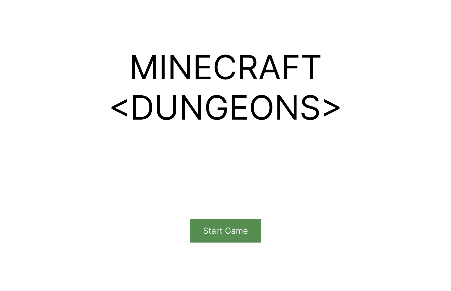
Minecraft Dungeons is a story-driven dungeon crawler game set in the Minecraft world. As part of my game UX/UI course with ELVTR, I replicated and redesigned the Minecraft Dungeons experience.
My Roles and Responsibilities
My task was to redesign the Minecraft Dungeons experience, recreating the existing experience or making changes where it makes sense to do so.
Length of the Project
Each part of the project took about 2 weeks to complete, for a total of approximately 2 months.
Challenges
- To figure out the player journey as the game progresses
- To create paper prototypes and see if the flow can be improved in any way
- To create mid-fi prototypes with an improved player experience
- To create hi-fi prototypes with a similar art style as the original, with improvements where necessary
- To design the UI in a way that ensures colour blind players can also enjoy the game
Work Process
For this project, I did the following:
- Player Journey
- Paper Prototype
- Flow Chart
- Mid-Fi Wireframes
- Usability Tests
- UI Moodboard
- UI Style Guide
- UI Mockups
- Accessibility Compliance
Player Journey
I started by going through the existing Minecraft Dungeons game and figuring out the player journey.

Paper Prototype & Flow Chart
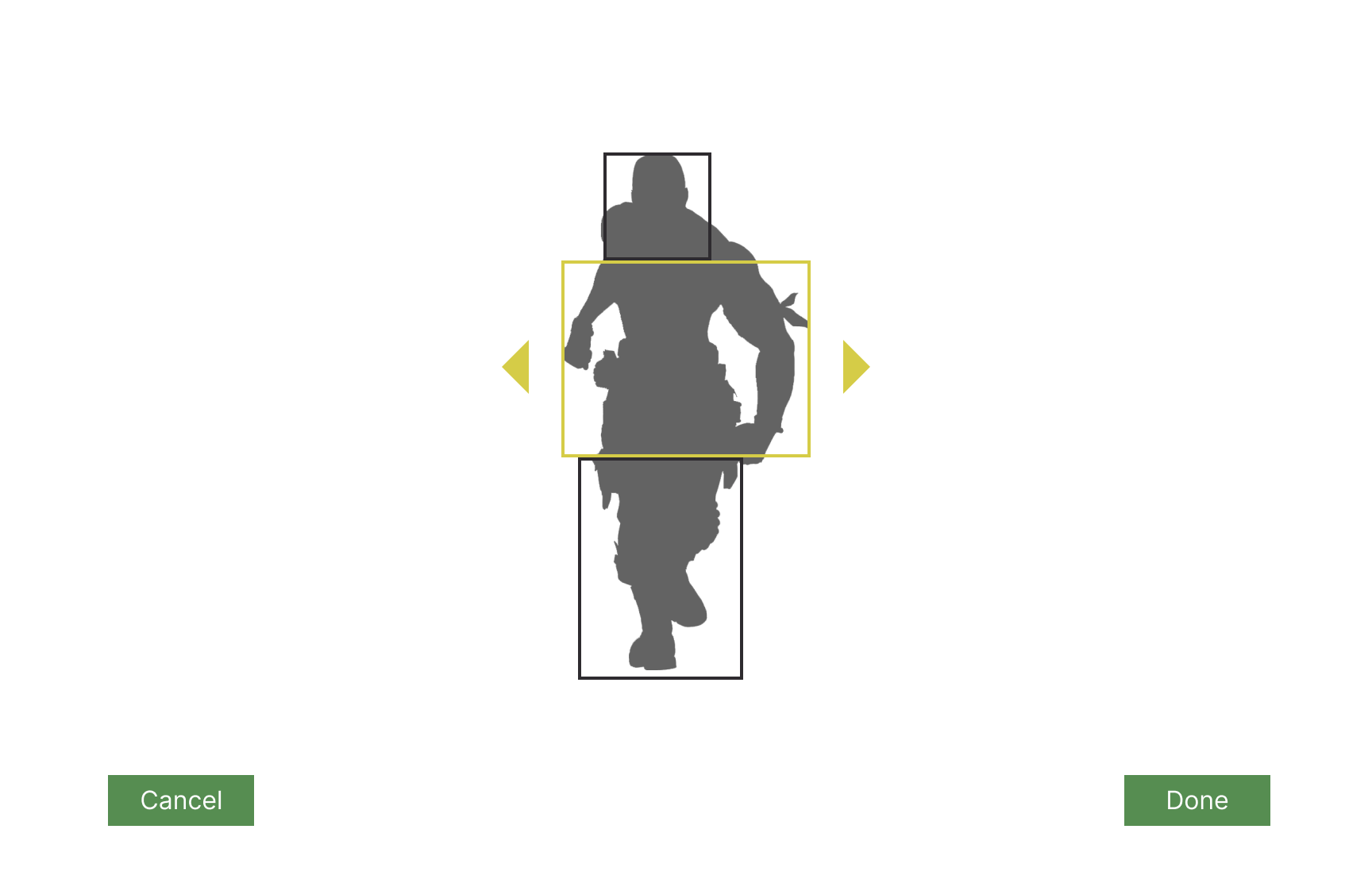
I made paper prototypes based on the existing game, with some changes. Most notably, I added character customization.

Based on the paper prototypes, I made a flow chart:

Wireframe & Iterations
I made mid-fi wireframes based on the existing game, with some repositioned buttons as well as extra screens based on the paper prototypes.
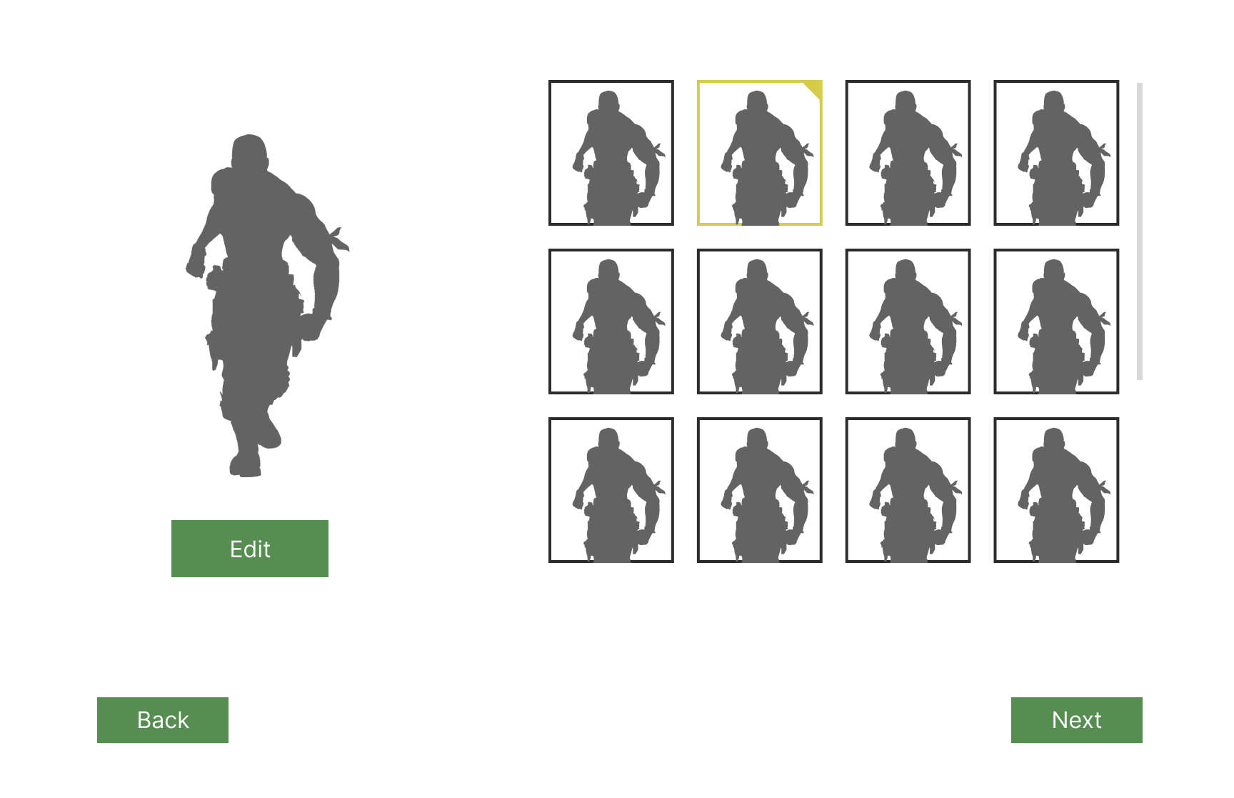
For the character selection screen, testing revealed that it wasn't obvious enough that the list of characters is scrollable. So I added a fade effect to make it more obvious.

Through testing, I found that it would be better for the difficulty text (i.e. "Default III") to follow the selected difficulty:


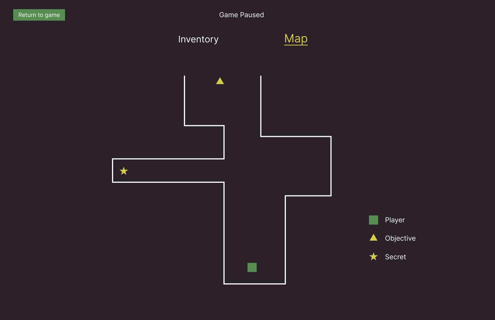
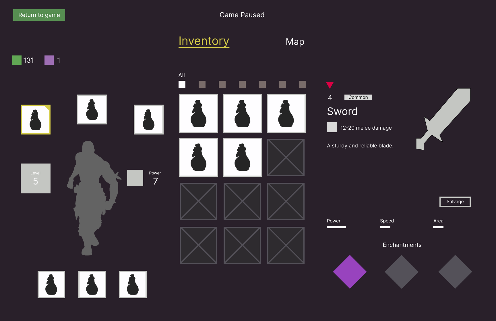
I also found that it would be helpful for players to see a full map rather than simply having an overlay. This would mean a separate screen for the map. Just like in various other games, the player should be able to switch easily from the map screen to the inventory screen:
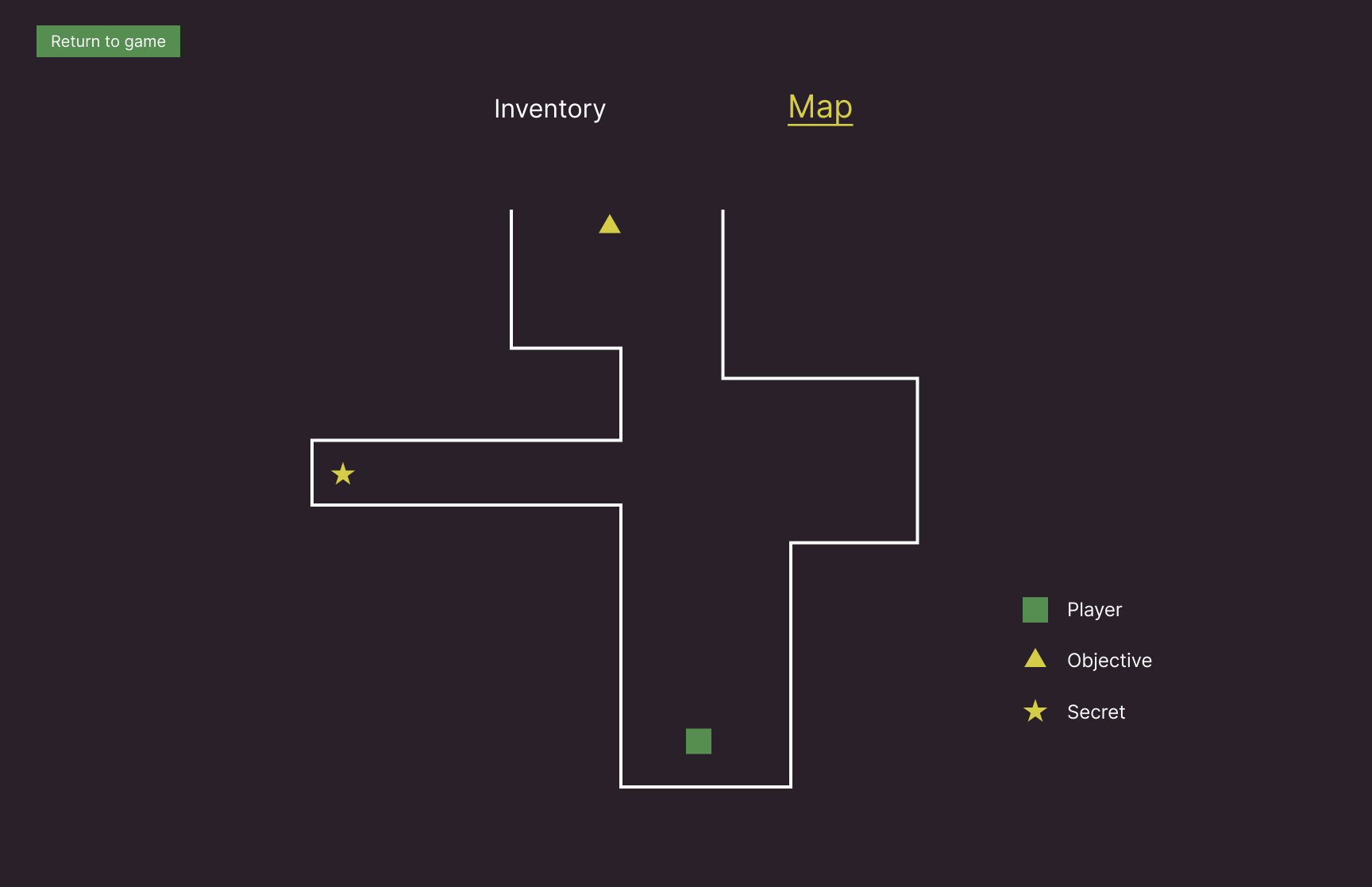

This would benefit from a change in gameplay, since there are now 2 screens that require a break from fighting. Like in many other games, bringing up the inventory or map screens should pause the game. Testing showed that the player should be made aware of this fact.
Here's the interactive prototype:
UI Styleguide & Mockups
I created a style guide based on a modified version of the original styles. I decided to use Pixelar as my main font for a clean yet pixellated look.


From there, I created hi-fi mockups:


Testing revealed that some icons would blend into the background if the player has certain types of colour blindness:


To solve this problem, I added a checkmark to indicate that a mission has been completed:

The checkmark made it much clearer that a mission has been completed:


Outcomes
- Figured out the player's journey through the game
- Created paper prototypes and improved the flow by adding an edit character screen
- Created mid-fi prototypes based on the improved flow chart
- Created hi-fi prototypes with a similar art style as the original, with screens based on the mid-fi prototypes
- UI is designed in a way that's accessible to colour blind players
Post-Mortem
- My Photoshop and Illustrator skills improved through this project. I'm excited to use those skills in future projects!
Other Works


Copyright 2021 Luke Yin. All rights reserved.